The Grange⌁Kennedy Wilson
An MXB Agency Project
Timeline12 weeks
Services
- UX Research
- UI/UX Design
- Video Creation
- Website Design
The Grange is a Kennedy Wilson owned development in the south Dublin suburb of Stillorgan, just 8km from the bustling city centre. MXB partnered with Kennedy Wilson to refresh the brand, coinciding with a new phase of the development. We delivered a brand, website, social media strategy, co-ordinating photo/video shoots, executing a wide variety of print and digital assets. This case study details my involvement in the project.
Research ✎
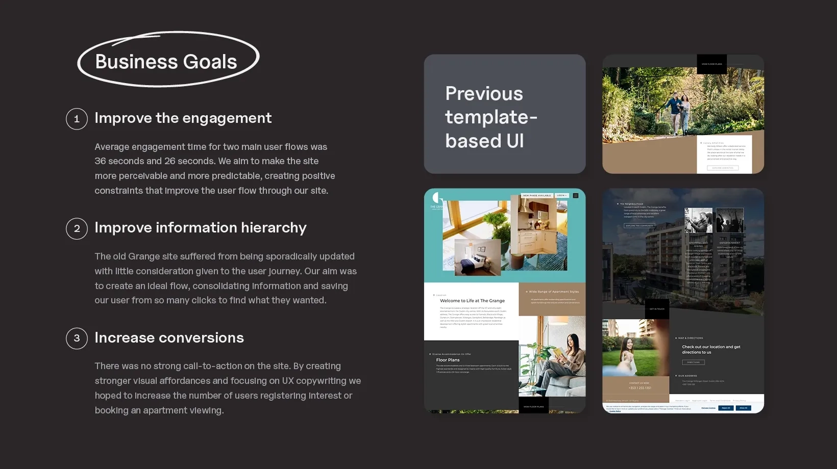
When Kennedy Wilson approached our agency to handle their marketing for The Grange, they had a website built using a template on Wordpress. The Grange project was about giving a new cultural destination a clear identity and a digital presence from day one. Research uncovered where the existing narrative lacked clarity and where visual language could strengthen perception, giving us a precise direction before any design began.
Ideation ⌲
Early ideation focused on simplicity with purpose. Rather than layering visual ideas on top of ambiguity, we concentrated on defining core expressions that communicate cultural value immediately. Each decision tested whether the brand could scale across signage, print, and digital without losing meaning.
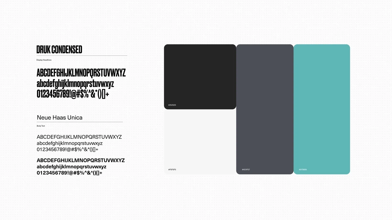
Visual Language ✎
The pre-launch execution of The Grange brand had a lot going on from an artwork, colour and illustration perspective. My goal for the website was to refine this, shedding many of the elements that would not translate to a highly legible, elevated site. Sophisticated confidence was the aim and I feel many of our decisions led us there.
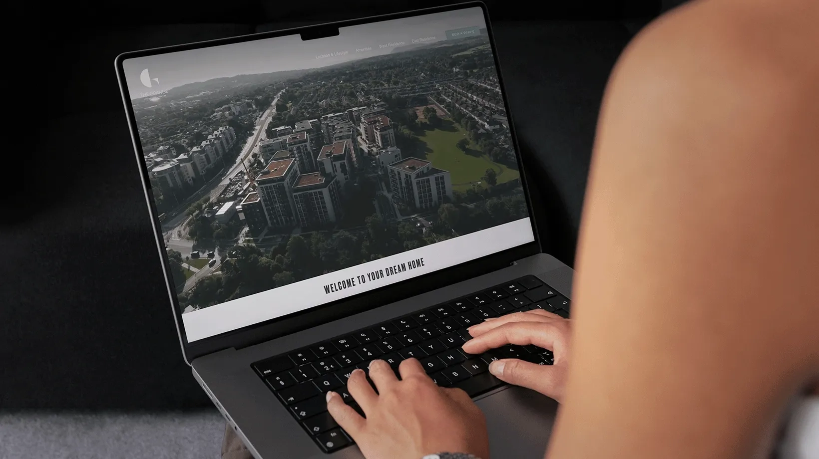
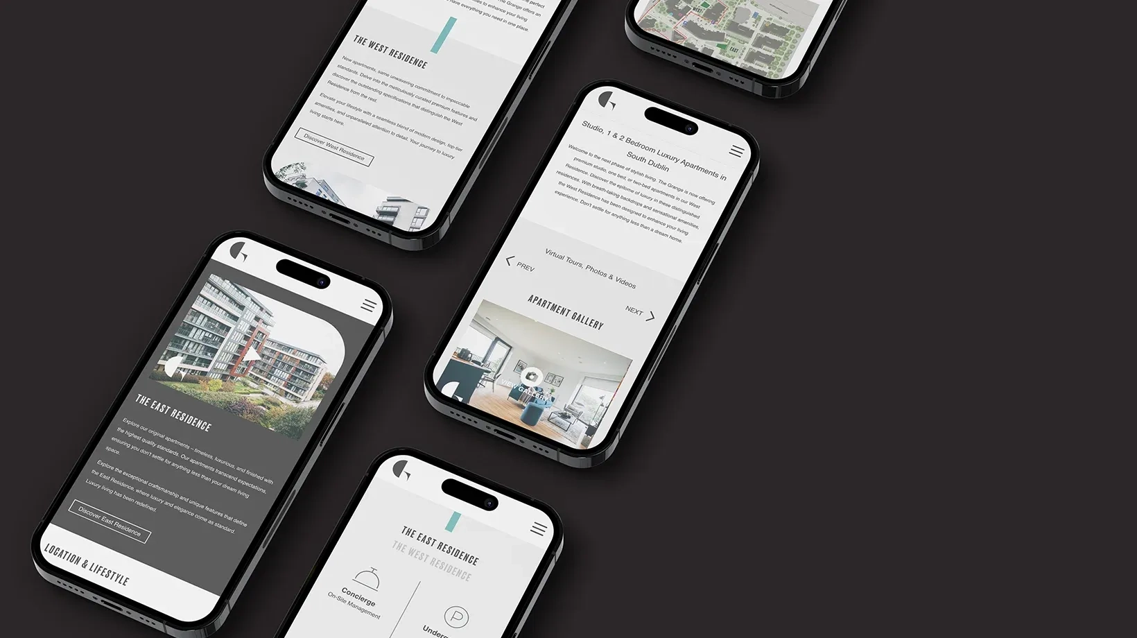
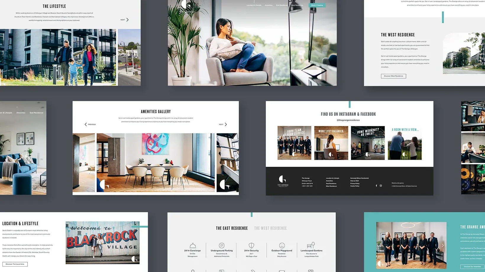
Design⌁Prototype
A high fidelity prototype allowed Kennedy Wilson to get a sense of how the final developed site would feel. Prototyping brought structure to content and journey. It ensured that digital interactions worked as intuitively as the physical space feels and removed assumptions before build. This approach created alignment across touchpoints and reduced rework, setting the stage for a launch that felt coherent and purposeful.
Solution ✌︎
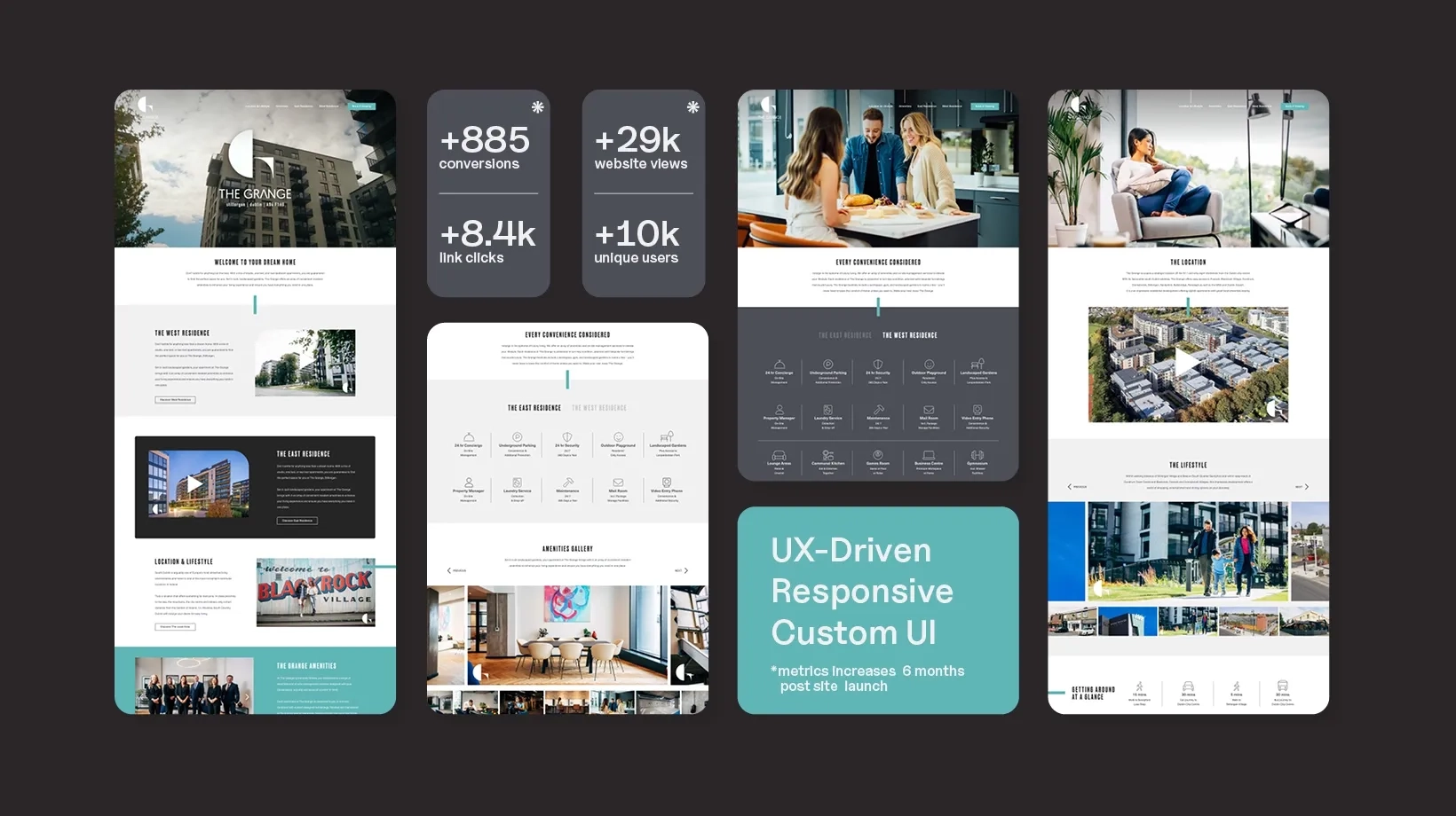
We increased their conversions (+885), link clicks (+8.4k), website views (+29k) and the amount of unique users (+10K) in the 6 months since launch.
We have since gone on to review and apply our processes to more websites for Kennedy Wilson such as The Cornerstone and Cooper’s Cross, again, seeing measurable results from putting the user first in our thinking and output.