Eyes Wide Coffee Co.
An MXB Agency Project
Timeline52 weeks
Services
- Art Direction
- Brand Design
- Brand Guidelines
- Project Management
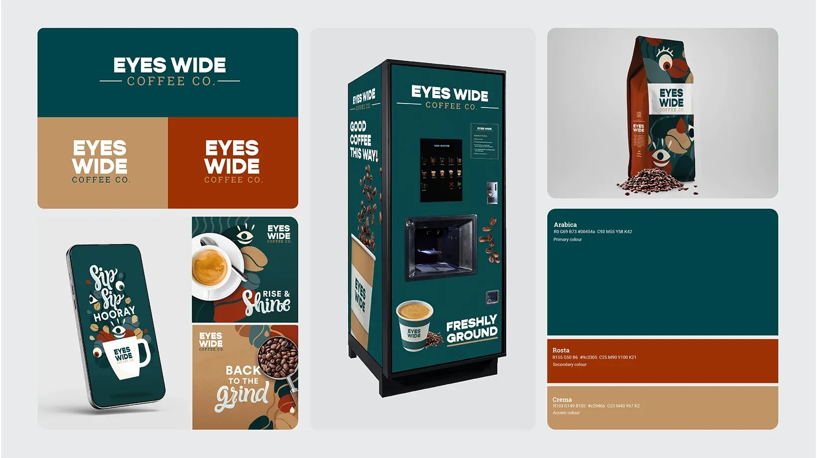
Coca Cola Hellenic approached our agency with a white label branding project at the end of 2022. Their target consumers including those in ‘at work’ spaces such as offices and universities. The coffee would be sold in vending machines and in office corners. We created a suite of naming and logo options, colour palettes, illustrations, print executions and brand guidelines. I helmed this project as Art Director and Lead Designer.
Research ✎
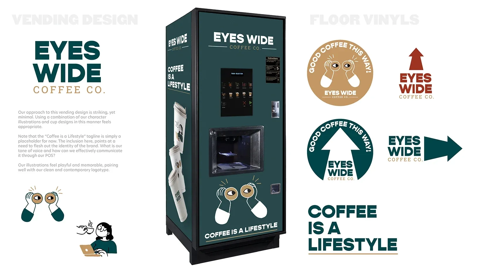
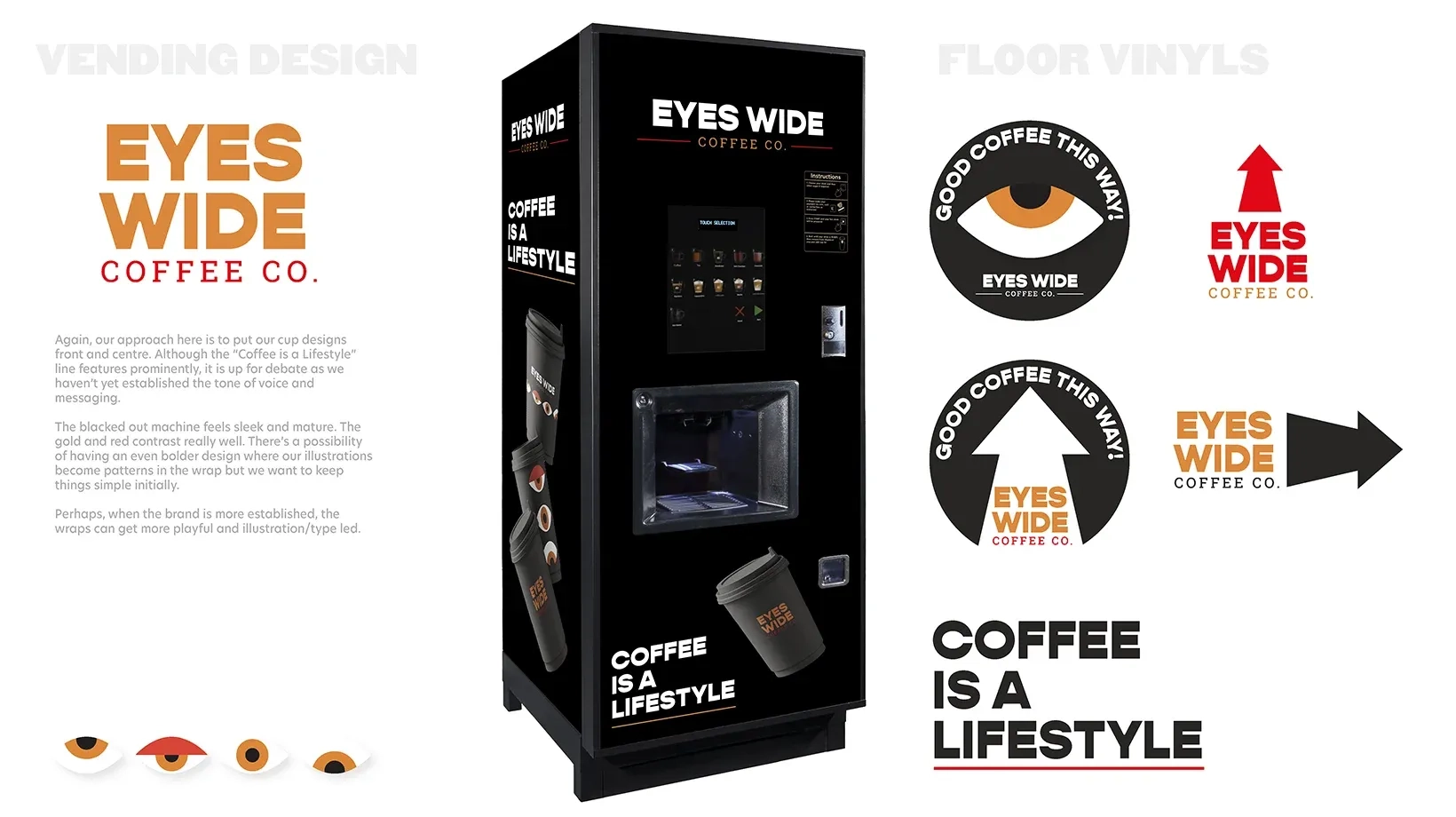
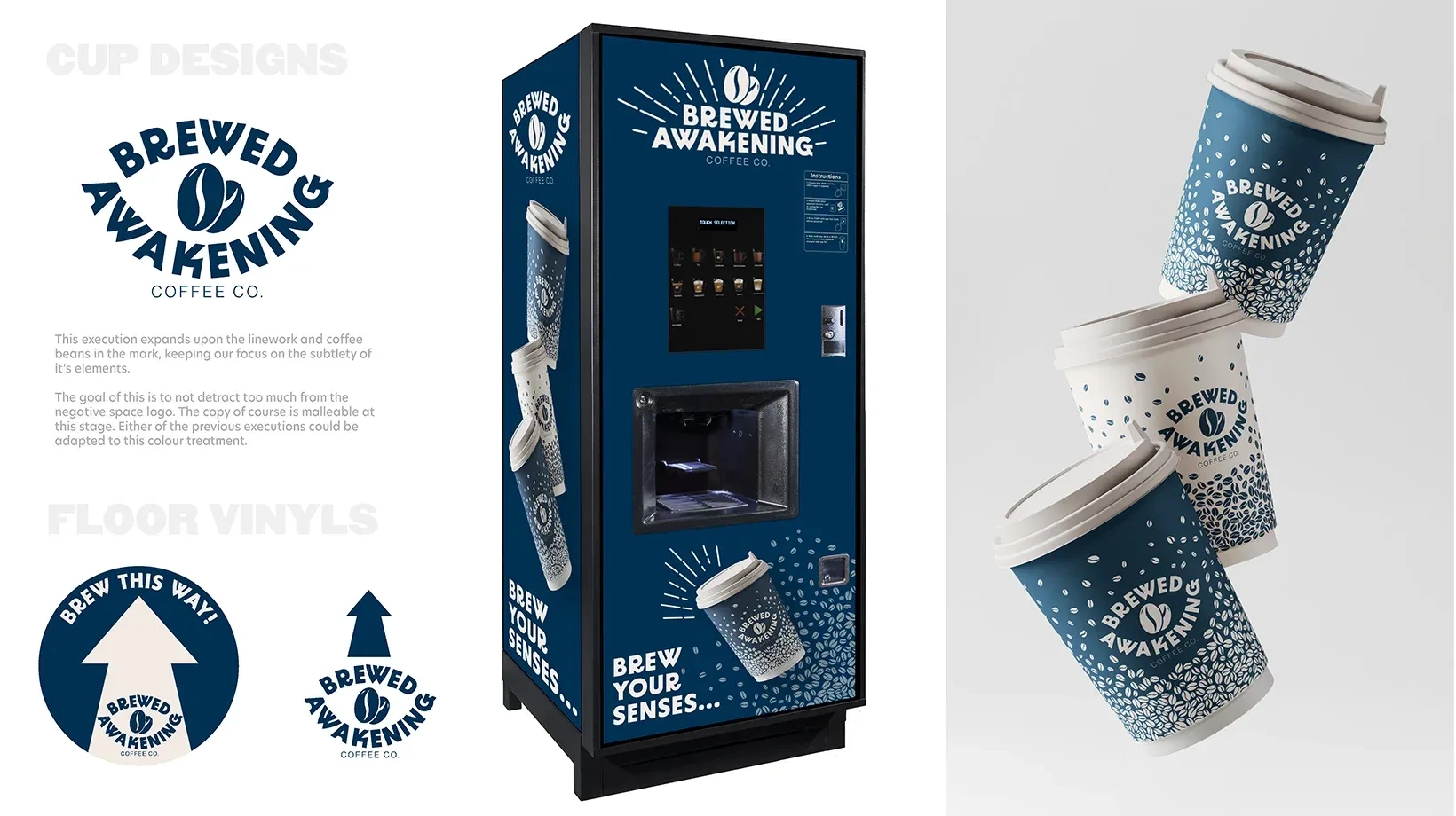
This wasn’t about creating another coffee brand. We focused on how young consumers experience coffee beyond vending, uncovering opportunities to make the brand feel relevant, distinctive, and purposeful in context.
Ideation ⌲
Naming and visuals were tested in real-world applications, not just on boards. Every choice aimed to make the brand resonate in offices, universities, and retail, blending familiarity with a modern, approachable edge. In this instance, working with a big entity like CCH means iteration. Hence the many varied concepts and naming options you see here.
Feedback ⌁
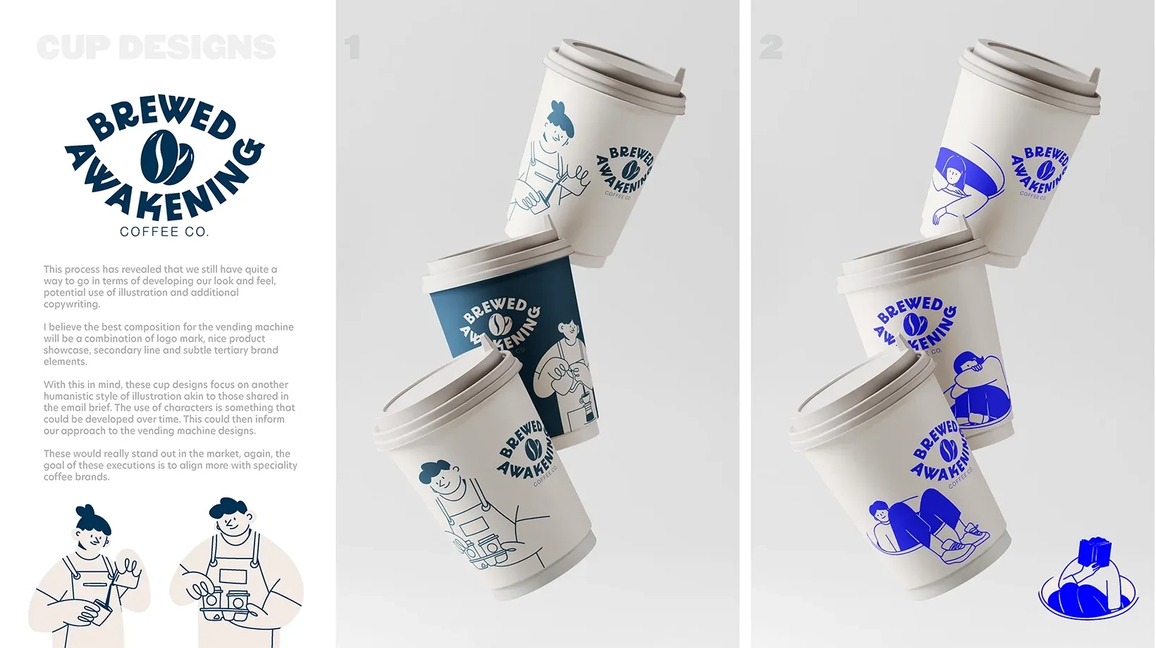
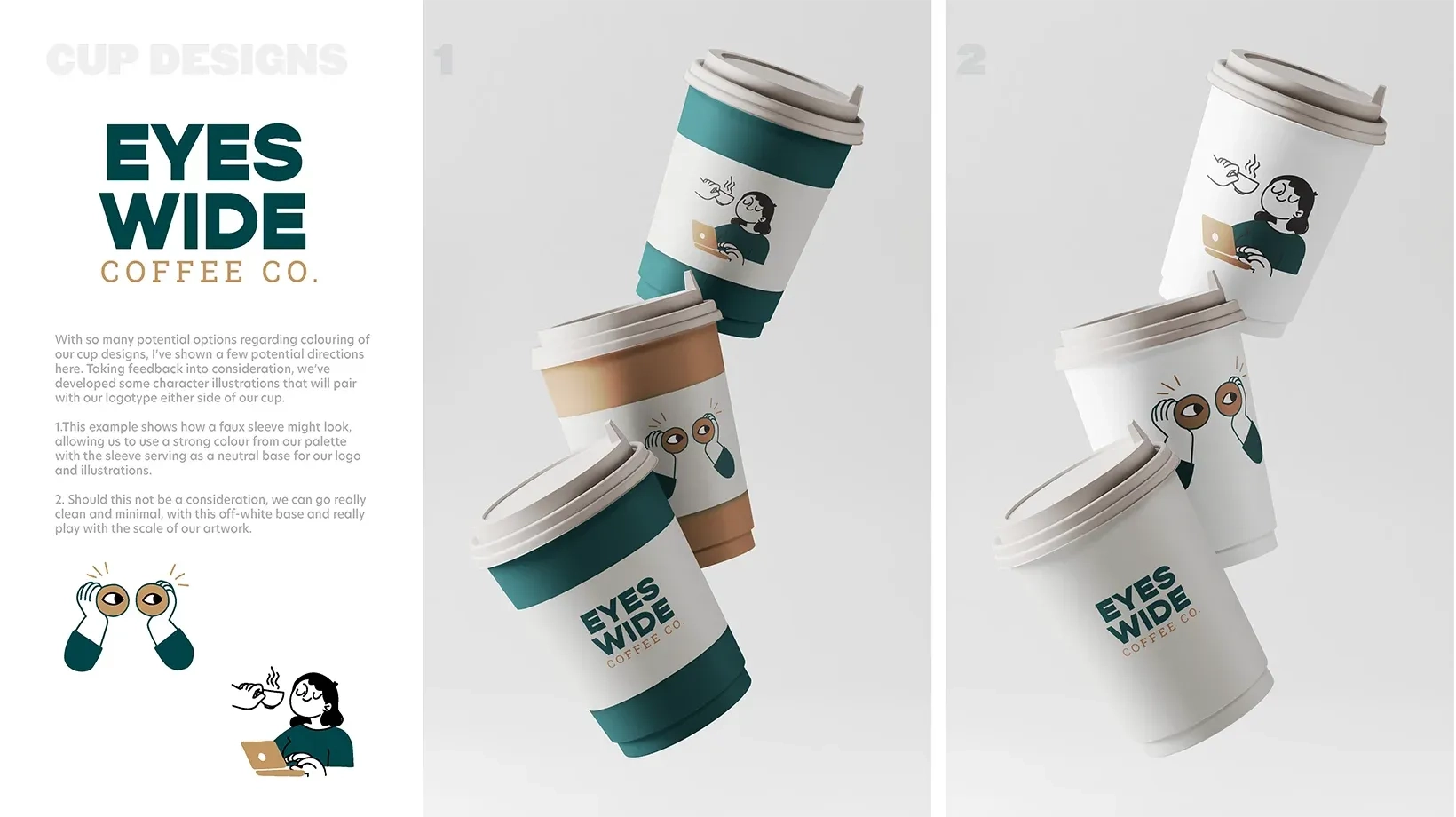
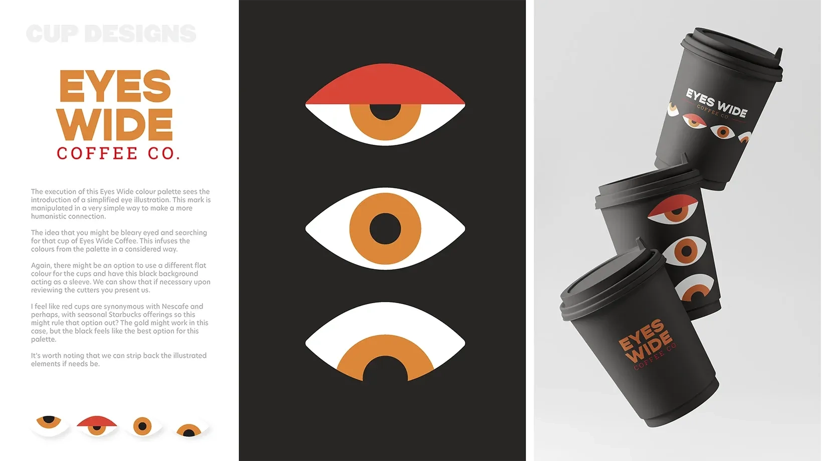
The name and logo execution were my own, whilst my fellow designer provided the ‘roasted’ palette and final illustration assets. The deliverables were ultimately much safer from a brand perspective, choosing to shed the illustration from the final vending and cup designs before going to market. Below, you can see our initial vision for the project rollout. Once in market, and seeing some success, a “Version 2.0” machine incorporating illustration has launched across the UK & Ireland.
Brand Guidelines ✎
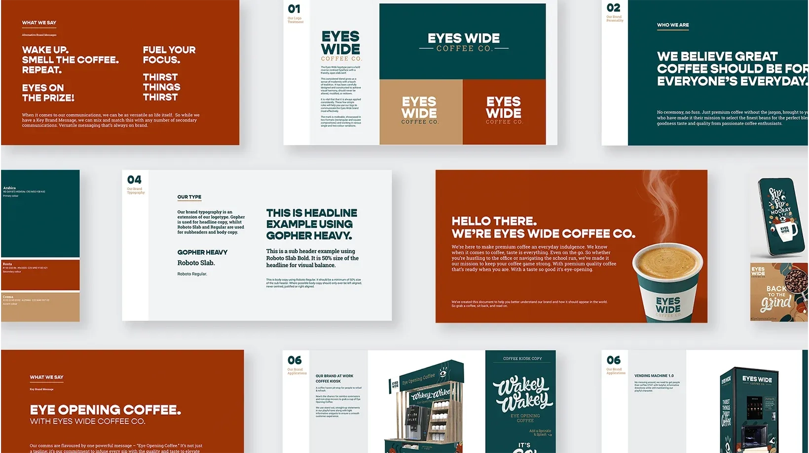
Once we got sign-off from the CCH team on the suite of amends, it was time to deliver brand guidelines. My remit was to over-see recommendations on layout, usage rules, colour, typography whilst Barry looked at tone of voice and Hannah, illustration.
Solution ✌︎
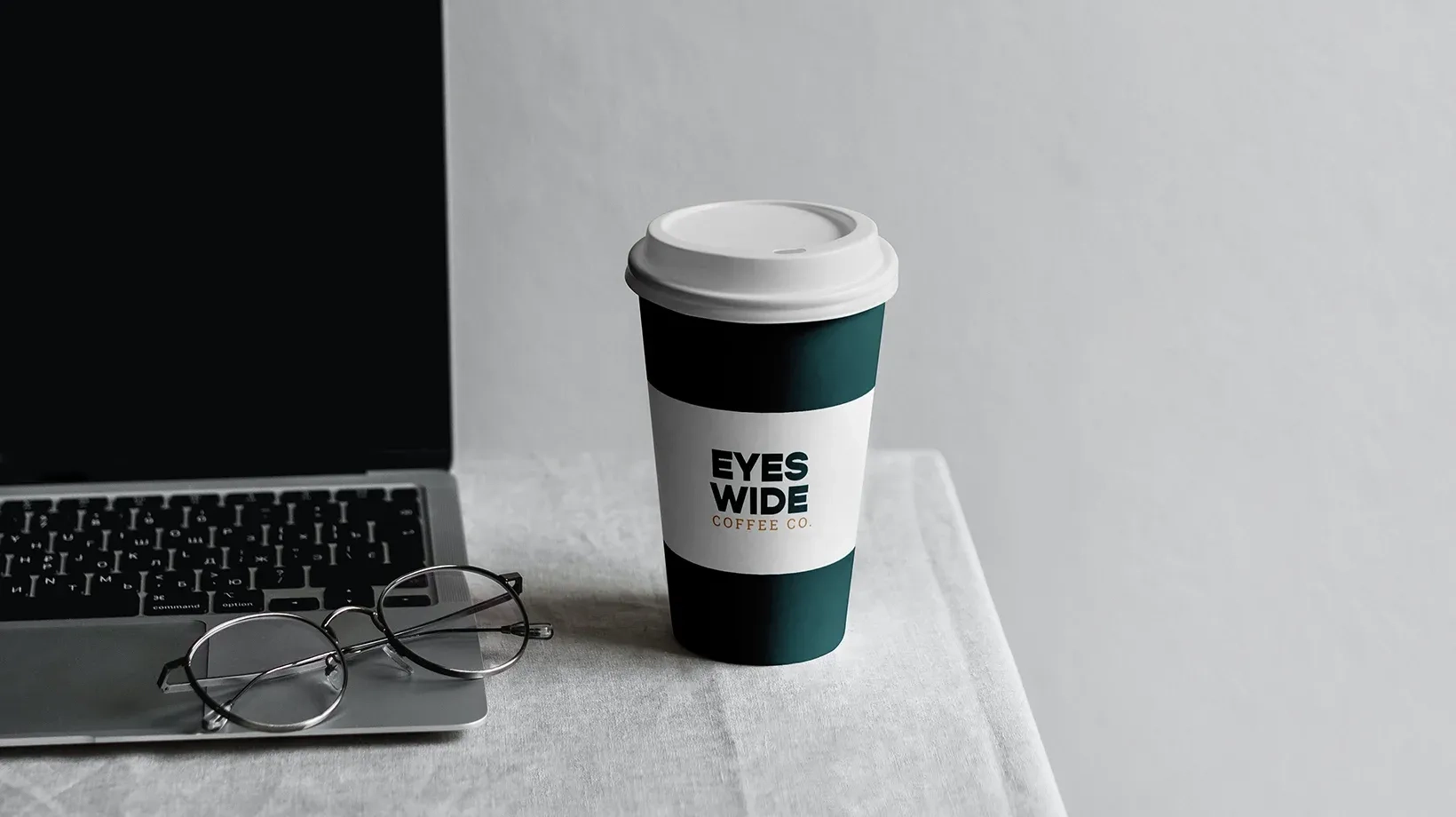
After spending so long on this project, it was a pleasant surprise seeing vending machine 1.0 at my local gym, as well as Belfast Central Station on my way to work during the summer. The project delivered a brand that isn’t just seen, it performs. Hilariously, I often get emails about the machine, certain drinks, calories and allergy information as this is seemingly the only online presence for Eyes Wide.