MXB Agency
An MXB Agency Project
Timeline28 weeks
Services
- UX Research
- UI/UX Design
- Art Direction
- Project Management
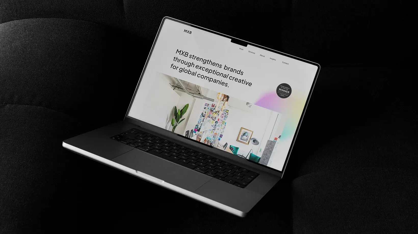
MXB is an award winning creative digital marketing agency based in Belfast, with 30+ years of expertise in design, strategy, and brand growth. Since joining MXB in 2019, there have been several attempts at re-vamping the agency website. My goal was to design and develop an elevated user experience through research and collaboration that better encapsulates the agency’s culture and capabilities.
Research ✎
MXB needed a platform that communicated its value clearly and converted visitors into meaningful leads. The previous site felt like a sporadically updated blog and didn’t communicate who MXB really is or what it can do. Research revealed friction in navigation, unclear messaging, and missed opportunities to showcase work, providing a clear blueprint for redesign.
Ideation ⌲
Wireframes tested user journeys and content hierarchy early, ensuring the structure supported clarity and conversion before visual design. Every choice was grounded in usability and business impact, not aesthetics.
Visual Language ✎
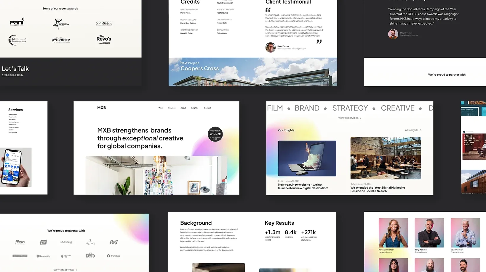
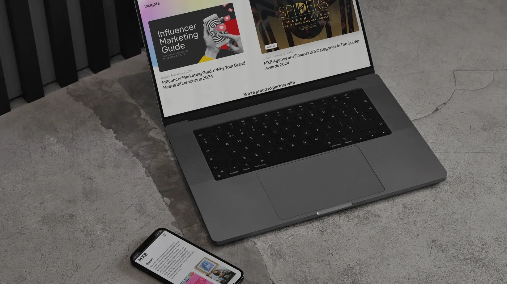
The design amplifies the work, not the interface. Clean layouts, thoughtful typography, and purposeful hierarchy make content easy to scan, helping visitors understand MXB’s expertise immediately.

Design⌁Prototype
Building a high fidelity prototype allowed the wider team to really get a sense of how the final developed site would feel. Prototyping allowed the team to see how the site functioned with real content, refining flow and clarity before build.

Result ✌︎
The redesigned site performs. Information is clear, case studies are actionable, and leads are higher quality. MXB now has a digital tool that supports pitching, storytelling, and growth, not just a pretty interface. Thanks to Karen and Barry for trusting me with this one. ✌︎